
It is not a rocket science but common sense to not paint a bedroom, where you want to relax and calm, with a strong vibrant color like red or yellow. Instead, you would use calm and lighter shades of the green or blue. Although, there are general rules regarding the appropriate colors for different rooms, the different colors, different effects. Each color has different wavelength and they are received and recognized by different parts of the brain it different colors can affect the mood or brain in different ways. Experiments have proved that colors affect our hormones, mood, and health. Therefore, color is important factor in interior design.
A scientific experiment on the effects of room colors showed that brain activity increased when people are in a red room while the blue room increased the wavelengths of the brain associated with relaxing.
Red = Brain activity increased
Blue = Brain wavelengths associated with relaxing increased
It proves that certain colors are more arousing than other colors. For example, red and yellow which are seen to be more arousing than blue and greens. This means that brain is aroused to long wave colors like red and yellow as opposed to shortwave colors like blue and green.
Color Temperature
Broadly colors can be divided into two based on its wavelength: warm and cool colors. Longer wavelength colors like red, yellow and orange are considered warm colors while shorter wavelength colors like blue and green as cool colors.
Color Tint and Shade
If you add white to a particular you get a tint of the color and if you add black you get the shades of color. There are different levels of tints and shades depending on the lightness or darkness of the color.
Color Theory in Interior Design
Warm colors are energetic, playful and arousing while cool colors. These colors can be used for kitchen, dining areas, and living rooms.
Cool colors inspire relaxation and meditation. Green, the color nature; blue, the color of the sea and other shortwave colors are good for bedrooms, bathrooms, and spas.
White, black and grays are neutral colors.
Geographically, cool colors are good for warmer regions and warm colors for cooler climates.
Factors Affecting the Appropriate Colors of a Room
There are many other factors to consider while determining the appropriate color for the room. The function of the room, its uses, the age of people who use the room, favorite and disliked colors etc. has to be considered before choosing the appropriate color for the room.
1. The Function of the Room
The use of a room and the identity of a room etc. have a big take on deciding the best color to paint the room. Is the room used for relaxing, sleeping or family to get together? It has a bearing on the appropriate color for a room.
As a general rule, certain colors are suitable for certain rooms and certain colors are to be avoided for certain rooms. Most houses have the bedrooms, living rooms, bathrooms, dining rooms, and kitchens. Larger homes have other types of rooms as well.
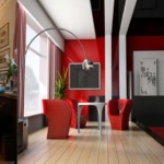
- Red stimulates the brain and it can be used to increase activity and passion.
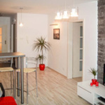
- A living room or family room has to be cheerful and the best color for this would be yellow.
- Bedrooms should have colors that are calming and relaxing. Blue and green are perfect for this.
- The colors in the kitchen need to stimulate brain increase the brain activity to keep people active. Red and orange are perfect for this.
- Red and orange also increase the appetite and therefore they are good dining areas as well.
2. Climate
Climate is another factor to be considered while picking the right colors for your home. It is better to choose cooler colors for the warm regions and warm colors for the cooler climate. People in rooms painted with warm colors would feel warmer and people in rooms painted with cool colors feel cooler. Therefore, choosing the right colors would help you provide a better environment inside the house.
3. Sun Light
If you get direct sunlight into the rooms through the window, you can use cooler colors because the sunlight is warmer. On the other hand, if the room doesn’t get any direct sunlight, warmer colors are best for the room to bridge the lack of sunlight.
4. Individual Tastes
It should also be noted that specific colors have a big impact on the people and it is personal. Hence, the color we love and the color we loath would vary from person to person which means the favorite and disliked colors are different for different people.
How to Choose the Color Scheme
Choosing the dominant color for a room is not the difficult process. You need to choose other subordinate colors that go well with the dominant colors. It doesn’t matter you chose the right and most appropriate dominant color for a room,
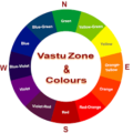
It doesn’t have to be challenging to choose the right color scheme. Interior designers and decorators use a trick to make perfect color schemes and you can use that too. It is called the color wheel.
All you have to is start with a color you love or the dominant color you chose for your room and the color wheel suggest you the best colors to pair with it.
How to Use Color Wheel for Interior Design
The color scheme is one of the key factors in any design aesthetics. In interior design, using wrong colors together would cause visual anarchy. A color wheel helps you to find out the best colors that go well with a color you chose.
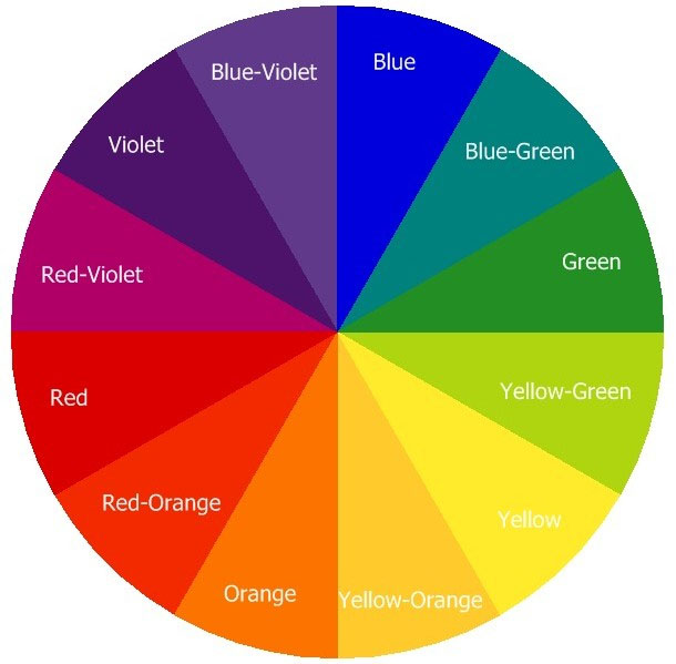
A basic color wheel contains 12 colors. Out of these 12 colors, 3 are primary colors: red, yellow and blue. These colors can’t be made by mixing other colors while it is possible to make different colors by mixing these colors.
If you mix any two of these primary colors equally, you would get a different color and they are called secondary colors.
Red + Yellow = Orange
Red + Blue = Purple
Yellow + Blue = Green
These colors positioned accordingly in the color wheel. If you again mix the adjacent secondary colors and primary colors, you would get tertiary colors and there are 12 tertiary colors.
There are lots of free color wheel tools on online. These color wheels are so complex that you have millions of colors available. These tools would help you to pick color schemes based on a color you choose. Based on the relationship between colors in a color scheme, there are different types of color scheme. Each type of color scheme has different effects on the visual appeal. These are different methods to choose different combinations of colors that go well together. Here is a list of most commonly used types of color schemes.
M
onochromatic:
This color scheme picks different shades and tints of the same color you choose. It is light for the eyes and gives a balance and soothing atmosphere. This color scheme doesn’t have a strong color contrast and therefore it would be difficult to highlight any focal points in the room using this color scheme.
Analogous:
This color scheme picks colors that are adjacent on the color wheel. Since they have similar colors, the color scheme looks good always. However, you should avoid picking too many colors or warm and cool colors together in the analogous color scheme. This color scheme has little bit more contrast than a monochromatic color scheme and so it is interesting.
Complimentary:
This color scheme picks the opposite color on the color wheel. These colors have completely different wavelengths and hence it has vibrant and dynamic appearance when they are used together.
The best way to use this color scheme is using one color as the accent color and the subtle shades of the other color.
Split-Complementary Color Scheme:
This is a subtle variation of the complementary color scheme. After picking the base color, you will choose two adjacent colors on each side of the opposing color. This color scheme offers much more balance than complimentary and a contrast without the bold intensity of complementary color scheme.
Triadic:
This method picks three colors with equal space between them on the color wheel. Three primary colors and three secondary colors are perfect examples for this. This color scheme also gives better contrast and vibrancy. The best way to use this scheme would be using one color as the base color and subtle shades of the other colors for better harmony.
Square:
This is similar to the triadic color scheme but four colors. There are four colors in this scheme and hence it should be used subtly to reduce the chaos. Choose one or two colors as base colors and other colors slightly for accent or give variety.
Tetradic:
This method would only work on color wheels with different shades of color. This color scheme gives much more variety than a square color scheme.
Color wheel makes it easier for a designer to pick the right color scheme for their designs. It is used by graphical designers, artists and web designers and interior designers. It is better ideas to find a base color or dominant color for your room before you work with the color wheel. The color wheel is used to find out the best combinations of colors. Always choose a base color based on the factors we discussed above and then use the color wheel to find out other colors that go well with the base color you chose.