

One of the fundamental, basic and easiest ways to transform any room is the use of colors.
You may already know that color has psychological effects and that is why certain colors evoke certain moods but what if I say you that colors can have effects on your bodies. It’s true. There are lots of studies proving the physiological and psychological effects of colors.
Interior designers in Chennai tell that there are many factors to consider while deciding the due to the importance of colors in interior design psychology. A color can be used to set a mood for an area. A white or very light shades of blue or green is required to create a peaceful atmosphere. That is why you can’t see red or yellow walls in a hospital.
Psychological Effects of Color
You might have noticed, most of the fast food restaurants use bright red or orange colors. It is proved that red color can increase our pulse and induce appetite. People will have a desire to eat when they see a restaurant in red or similar color and that is why restaurants use red or other bright warm colors.
Now you know the importance of color scheme in interior design. The color of the interiors should be decided based on the ambiance, mood and emotion you want for an area.
How to Pick the Best Colors for the Interior
Commercial buildings, retail shops, restaurants, coffee-shops and residential buildings have different colors of schemes that would work. The color scheme is determined based on the character you want to have for the building.
When it comes to residential buildings, there are different styles of architecture and interior designing. This also determines the color scheme for interior designing.
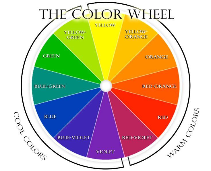
For example, warm colors like red, maroon and brown would be great for the interiors of a traditional house. When it comes to a modern building, it needs white or lighter shades of the cool colors. If you don’t know what cool and warm colors are, you can check the graphic below.
While you decide the colors for your interiors, you also need to pick a shade for these colors. All shades of the same color are not the same. Bright and dark red are red but they are not the same. A color can have different variations it is determined by it saturation and lightness.
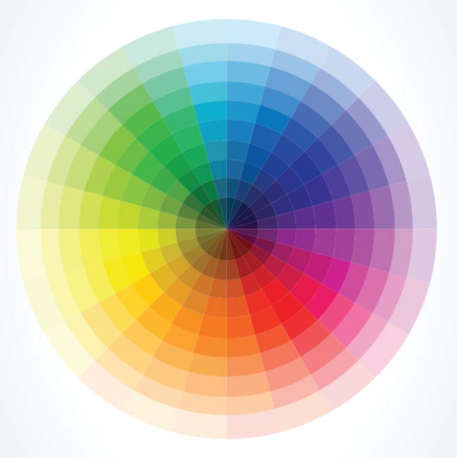
Color has three properties: Hue, Lightness, and Saturation.
Hue is color like red, blue and green.
Lightness is the brightness of the color. A color with less light looks dark and dull while a color with high lightness looks bright.
Saturation is the intensity the hue is. The same color may have different saturation and based on that the intensity of the color change. Based on the lightness, the color becomes white, black or gray based when the saturation is decreased.
The character of the color change when the lightness and saturation are modified.
If you are interested to know how to make use of color wheels in interior design, you can do the following.
Choose complementary colors for contrast and drama.
Choose different shades of the same color for monochromatic.
For more information and make color palettes, you can visit: https://www.sessions.edu/color-calculator
There are many practical aspects to consider while picking the colors
Light Colors for Small Houses
Small apartments lack space and so it would look stuffed even with basic furniture items in the rooms. Painting the walls and ceiling with white color or lighter shades of green or blue can make the rooms look appear larger. Lighter colors can expand the boundaries of space and the rooms get more depth.
A ceiling with a darker color would make the room appear like it has less height.
The objects in the lighter colors have less visual weight while darker colors make objects appear heavier.
Moreover, white colors reflect light and the room will look brighter. A room appears bigger if it brighter also.
Therefore, lighter colors are a great way to make a small room appear larger and less cluttered.
Remember, all these are visual illusions and it has nothing to the physical space of the room.
Cool Colors for Relaxing
Lighter shades of cool colors like blue and green can make the rooms appear cooler and so it is good if you want to make a room suitable for relaxing and calming. Therefore, these colors are great for bedrooms.
Yellow for Joyful
Yellow color can make a sense of warmth and well-being and is associated with happiness and optimism. This color is great for living rooms where you spent time with your family. However, bright yellow is not recommended. Yellow makes people cheerful and energetic. Moreover, it improves the mood of people, makes them forget their troubles and encourage conversation.
The yellow color is also good for exercise rooms or gyms.
Color Scheme for Contemporary Architecture
White, gray, black and soft shades of green and blue are generally good options for modern and minimalistic interiors. Use of different shades of gray can enhance the style and if it is used with soft shades of any other color. The atmosphere has a neutral and formal mood.
Color Scheme for Traditional Style
The rich tones of brown, red, golden etc. are generally used for houses with traditional design. Deep shades of the warm colors and colors of trees, soil and other natural elements associated with tradition would be best options when it comes to the interior design of traditional houses. White and light shades of cool colors would be weird if you want to keep a traditional feel in the interiors.
Classic Royal Style
A classic house requires rich colors to amplify the personality of the house. Colors like golden, yellow, purple and dark grays would be great options for classic luxury homes. A house with royal style can have wooden colors, brown and darker shades of red and in the color palette.
These are few importance things that you should consider while picking the colors for your interiors. Along with the colors of paint and items in the room, it is also important to consider the lighting. The tint of the lighting shouldn’t be contradictory to the color you want for your interiors.